Evolution Of A Design: HATCHLINGS
Hello all! This is Intern Bre here, I’m so excited to embark on this artistic journey with Devin to create a brand and materials that will be interactive, creative and useful for all families and nature-loving people alike!
Inspired by their recent shift into homeschooling their kiddos, Devin felt a calling to jump into the business of creating their own nature-based educational materials to share with the world. Illustration, nature and their kiddos’ education! What could be a better combination?
Hatchlings will soon be a place to find nature discovery journals, posters, t-shirt designs for parents who want to show their kids the beauty of the earth. Keep your eyes open for a surprise item that will be released VERY soon!
The first step in launching the brand was to create the logo! It was a collaborative process between Devin and I and we were determined to create a perfect logo that exuded everything Hatchlings would stand for!
Here’s how the Hatchlings logo was made:
concept #1
discovery:
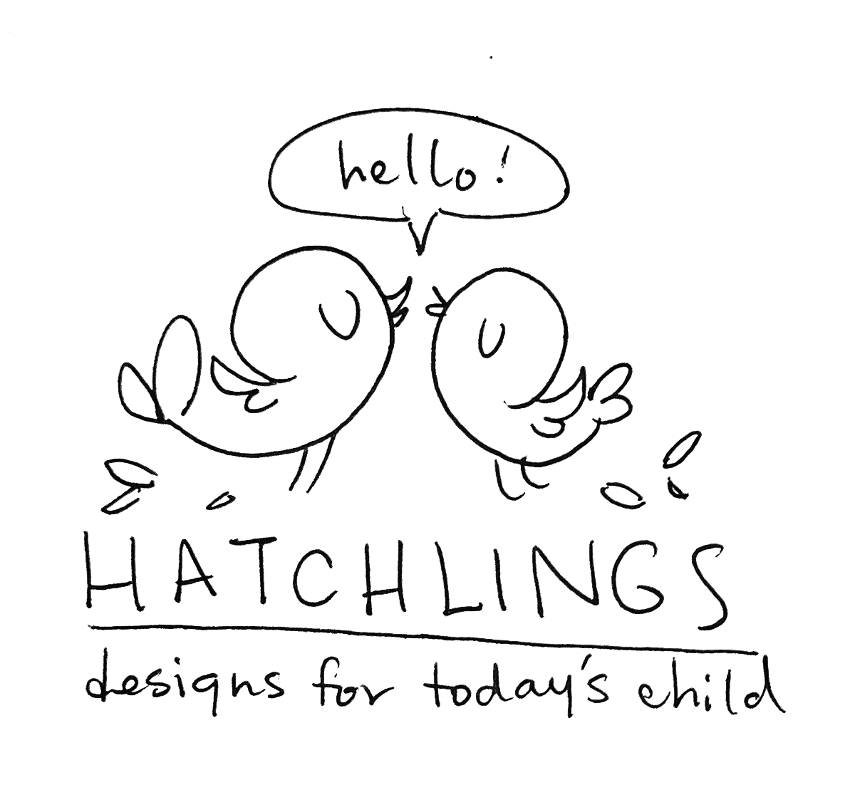
I’ll start by showing the initial sketch for the logo. The two birds are intended to represent Devin’s two young children. The initial inspiration for this logo was a clean yet playful concept. Something modern and cute that played to visual elements that would appeal to children and parents alike.
Initial Inspiration:
Proofs #1
This one took a lot of back and forth until we came to the consensus that we’d exhausted it. We both loved this sketch and concept, the birds were fun, playful and unique—but something wasn’t clicking.
SO…back to the drawing board!
Hatchlings stands for:
New Inspiration:
Our second round of inspiration combined design elements from Scandinavian folk art (Rosemåling), bright and cheerful colors and modern simplicity. Maintaining the two-bird motif was a MUST for Devin, so I went back to the drawing board!
Now we’re getting somewhere! These sketches were the gateway for the final design, I refined the simplicity of the birds, maintained a fun and friendly style with room for variation.
Proofs #2
For the second run of proofs, I designed two logos that spoke to the sketches both of us liked. Devin loved the one with the vines, so taking the updated bird design and putting in some neutral greys, I was really happy with how this one looked. Upon reflection the two birds ended up looking like lovebirds, rather than a brother and sister and we wanted the colors to be bright and fun.
This second one was my favorite, I drew from the inspiration above and used off-centered shapes of color to fill the birds in. I also went in with thick lineart so that the birds were easily recognizable.
The final touch was font. Finding the perfect font is extremely hard (there’s a reason most universities have 4 Typography classes). We wanted something fun and playful, yet legible and the Josefin Sans that I had placed with these logos just seemed too rigid.
The font in our logo is actually Devin’s handwriting! While on a conference call, scouring the internet for fun font, they wrote this out and we both fell in love with it! It’s fun, playful and truly unique to Hatchlings.
FINAL DESIGN
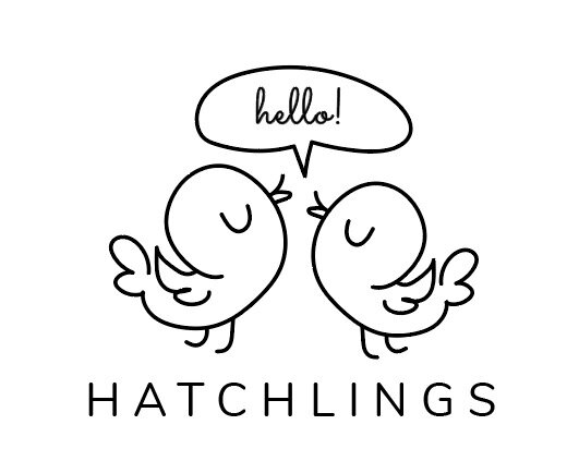
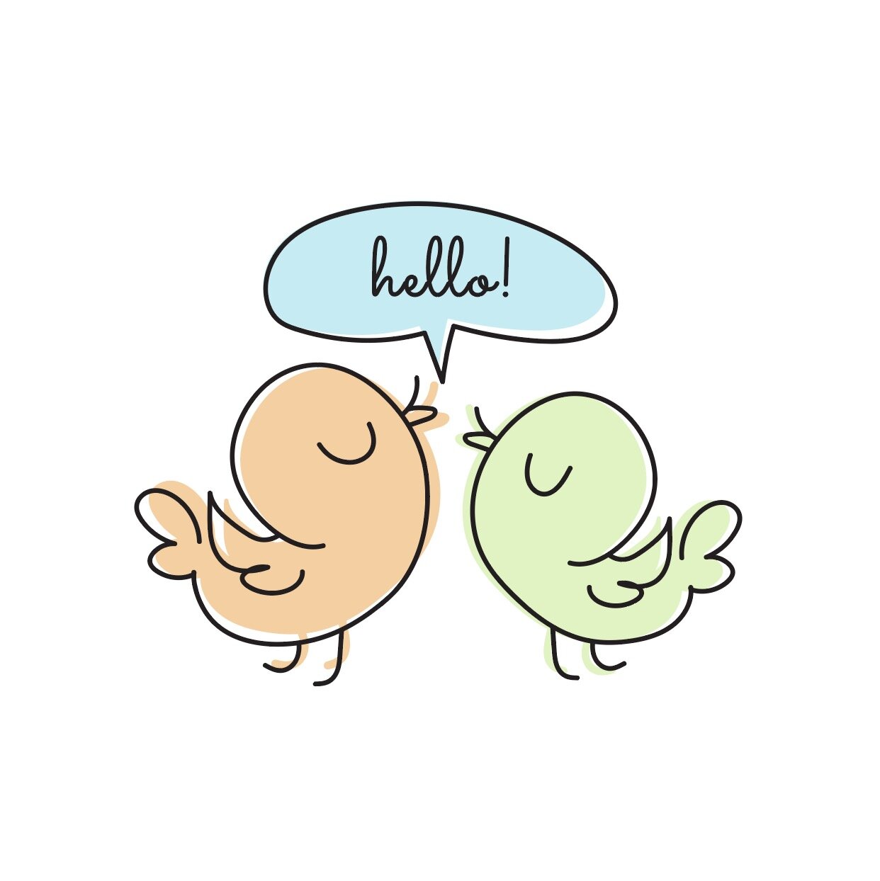
TA-DA!! Combining elements we both loved and a fun handwritten font, we’re in love with this final result! Below you’ll see the main logo, an illustrative version and the word mark!
main logo
ALTERNATE, ILLUSTRATED LOGO
WORDMARK
A cohesive word-mark is ALWAYS a great design element for a brand. I think this is my favorite design element!
